Articles

  • Tuesday, November 02, 2021 9:49 PM | Debbi Lester (Administrator)


    It’s not surprising that there’s a revival of interest in the life and work of Sister Mary Corita Kent (1918-1986). The only surprise is that she fell off the radar in the first place, and remains relatively unknown. 


    It’s not like Kent labored in obscurity. She was named woman of the year by the  L.A. Times in 1966, and featured on the cover of Newsweek in 1967 (“The Nun: Going Modern”). In 1984, one of her designs sold more than 700 million copies (it was a popular, even iconic, U.S. postage “LOVE” $22 cent stamp)—but that was a special case, and anyway we are getting ahead of ourselves. 


    Why the revival? For one thing, a favorable zeitgeist: social justice movements like BLM and #MeToo, the resurgence of progressive and activist voices in media and politics—all these resonate with Kent’s vision and convictions. She instigated happenings and be-ins before any of these things were a thing. Her work addressed world hunger, poverty, and the war in Vietnam, but all in a spirit of playfulness and hope. She titled one of her final prints “Yes we can.” It’s hard to imagine a more inspiring model—but we don’t have to imagine her, we just have to remember her. 


    To this end, you can visit an exhibition at the Davidson Galleries, “Sister Mary Corita Kent: Speak Out.” This exhibit presents pieces from all phases of Kent’s varied career. Its focus is on the artist’s serigraphy, but the show also includes books she authored, and other surprises.    


    The artist was born Frances Kent in 1918. After high school she entered a Roman Catholic order, the Sisters of the Immaculate Heart of Mary. She took the name Sister Mary Corita Kent and taught art at the Immaculate Heart College in L.A. The college was a hotbed of liberalism and the avant-garde, and Kent its liveliest live-wire. It was her teaching methods, not her artwork, that drew visits from Charles and Ray Eames, Buckminster Fuller, and John Cage. (Her classroom rules still circulate on social media, though they are sometimes attributed to Cage, not Corita Kent.)


    At IMC, Kent made art communally, democratically, allowing students and peers to decide colors, to contribute passages of text she might then draw into her creations. Art making as collaboration, as connectedness. Her tool of choice, screen-printing, was not only DIY, it was all about mass production: she meant her images to spread outward, to make impressions on as many minds as possible.


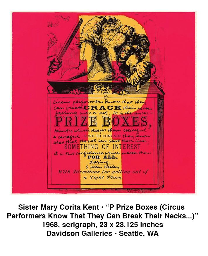
    The “Speak Out” show includes several of Kent’s early pictorial works from the ‘50s—she made her mark with these, but it is not the work she is most known for. Muted in color, these prints deal with medieval religious iconography. They stand in contrast to the vibrant colors and free-flowing gestures that came later, but they are remarkable statements on their own terms.


    In 1961, Kent saw the first solo show of an unknown commercial artist from New York, Andy Warhol (thirty-two Campbell soup can labels at L.A.’s Ferus Gallery). Pop Art energized the art world, but for Sister Mary Corita Kent it had deeper ramifications. It seemed to fit with the radical changes rippling through her faith: the reforms of Vatican II. Suddenly the Roman Catholic mass would not be in Latin but in the vernacular. Kent was already ahead of all these upheavals and she embraced them with gusto. 


    Kent began to include imagery from consumer culture. She appropriated Wonder Bread’s brand elements—those colored dots—but not as a nod to Warhol and his soup cans. She was riffing on the Catholic ritual of the Eucharist, the sacramental bread. And perhaps commenting on world hunger, a pressing problem of that time. Audacious moves like these, she felt, were aligned with Vatican II directives. (Her Archbishop came to see it differently; under pressure, Kent eventually left the sisterhood and moved to Boston.)


    Text became central to Kent’s work. At first, excerpts from the psalms. Soon pop lyrics of the moment appeared. “Don’t you need somebody to love?” “Let the sunshine in.” “Help!” These she juxtaposed with longer passages from weightier sources—secular writers with a strong spiritual game were favorites (Whitman, Camus, Arendt). She quoted her renegade contemporaries, like Martin Luther King Jr., and the Jesuit priest Dan Berrigan, an anti-war activist who brought some disorder to his religious order. 


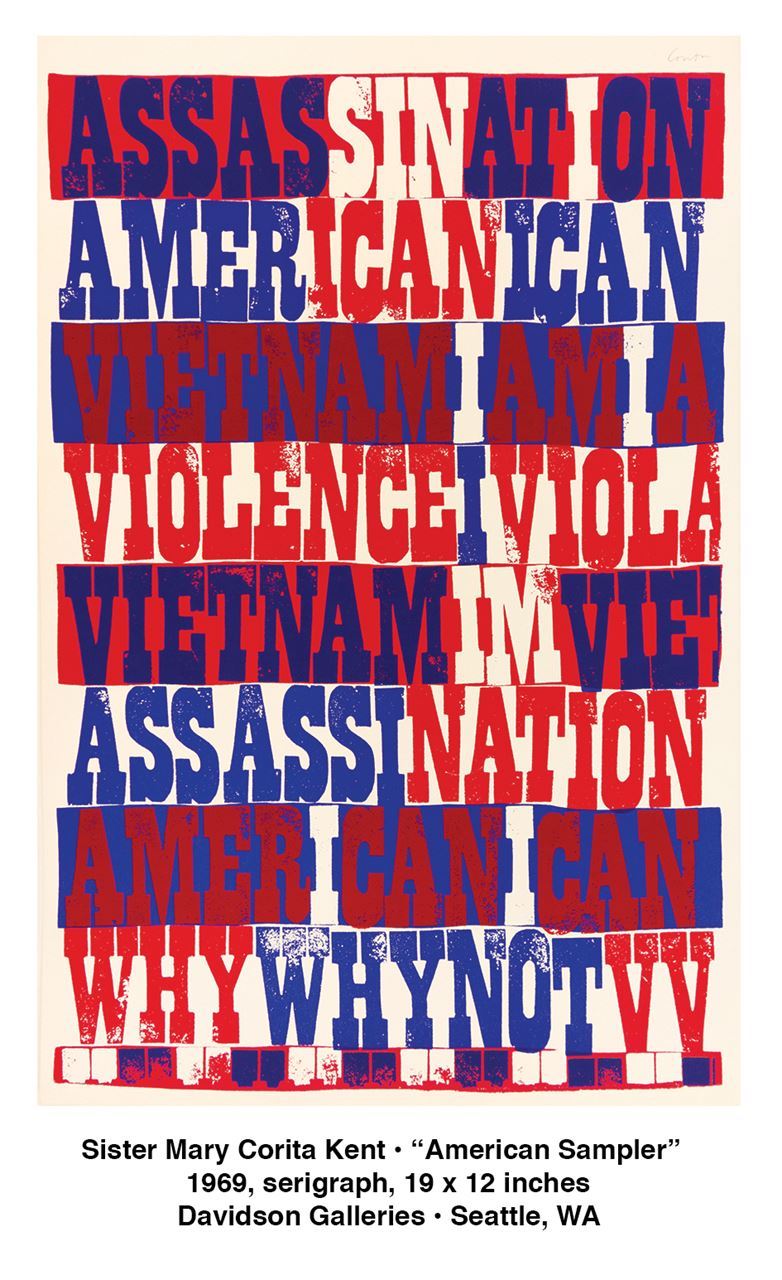
    With her distinctive (and barely legible) handwriting, she set her texts within or between freeform shapes and brushstrokes, or scrawled within commercial letterforms ripped from billboards. (She dearly loved a good billboard.) A highlight of the “Speak Out” show is “American Sampler,” an almost purely typographic piece. The slab-serif letters in red, white, and blue ink have a menacing presence. Variations in color reveal shorter words within the larger words—“I CAN,” “SIN,” “NATION.” (Did she set the M, I, and A together as a reference to missing soldiers, or some other absence?)  


    Her later work took on an airier and more peaceful tone, as if a storm had passed. An example at the show is “The Common Dandelion” with its bit of Emerson “The invariable mark of wisdom Is to see the miraculous in the common.” 


    Kent did not confine herself to screen printing. She authored and illustrated books, and “Speak Out” includes some of these titles, including two from her “Believe” trilogy. The books may seem dated to you, unlike her prints, which appear to be ageless.


    The show also includes some prominent commissions, including one of Kent’s most popular pieces, a US postage stamp, now iconic, with its six rainbow-colored strokes and the word “LOVE.” At Davidson Gallery, the stamps appear on a set of addressed envelopes—it is charming to see not just the design but the actual stamp itself in use, as designed, in all its commonplace ordinariness. Or do you see something extraordinary there, too?


    The postage stamp may be Kent’s most recognizable image—the USPS issued more than 700 million of them—and it is certainly her smallest. But another contender for that “most recognizable” claim is the mural on the Boston Gas Company’s liquified natural gas storage tank, a 140-foot-tall container near downtown Boston. It is the largest copyrighted work of art on the planet, and yet it’s simplicity itself: six rainbow-colored strokes. (In this regard, the Boston Gas Company liquified natural gas storage tank and the tiny US Postal Service stamp are unified—talk about designs that scale well!) It is regrettable but understandable that the Boston Gas Company’s liquified natural gas storage tank will not be on display at the Davidson Gallery for this show. But you’ll be content to see the stamps, the books, and above all the marvelous prints of Corita Kent.


    Tom McDonald

    Tom McDonald is a writer and musician living on Bainbridge Island, Washington.


    The “Speak Out” exhibition featuring art by Sister Mary Corita Kent, is on view November 5 through December 24, Tuesday through Saturday from 11 A.M. to 5:30 P.M. at Davidson Galleries in Seattle, Washington. For more information, visit www.davidsongalleries.com.


  • Tuesday, November 02, 2021 9:31 PM | Debbi Lester (Administrator)


    in a morning conversation


    at a fork 

    in the road

    beside weeds

    a large pothole

    impersonating a lake

    invites my eyes

    to skate over

    the mirror

    of its reflection


    a bowl of clouds

    in a morning conversation

    about where this day

    might be heading


    and later that evening

    a gibbous moon

    stoops down

    to drink from this water

    admiring its complexion

    and wondering

    what to do

    with this silence


    Alan Chong Lau


    Alan Chong Lau is a poet and visual artist based in Seattle, Washington. He serves as Arts Editor for the International Examiner, a community newspaper. As a visual artist, he is represented by ArtXchange Gallery in Seattle, Washington.


    John Levy is a poet and photographer. His most recent book of poetry, “Silence Like Another Name,” was published by Otata’s Bookshelf. He lives in Tucson, Arizona.


    Alan Chong Lau and John Levy have published three volumes of a poetry and photography collaboration online that can be found by searching online for “eye2word.”


  • Tuesday, August 31, 2021 3:05 PM | Debbi Lester (Administrator)

    Fulgencio Lazo at ArtXchange Gallery • Seattle, Washington


    To be a painter is to have a responsibility to others.

    Our work must have a purpose. It must give life and hope. 

    —Fulgencio Lazo


    In the Seattle art community, Fulgencio Lazo stands out for both his dazzling paintings and his commitment to community. Based in both Oaxaca, Mexico, where he was born, and Seattle, where he came to study art as a young man, he connects the two regions in many different ways. 


    Fulgencio Lazo’s new exhibition at ArtXchange Gallery, “Estrellas del Norte al Sur” (Stars from North to the South), sings from the walls. His layered imagery builds from geometric shapes and lush color that gradually emerge as specific references. Fulgencio combines the magnificent color and energy of his native Oaxaca, with abstract modernist structures and his personal iconography. Within his paintings and sculptures, he also embeds the social issues facing Mexicans today. In this exhibition, he focuses on the migration of children. The artist is honoring the challenges that children face as they emigrate at the same time that he celebrates them. 


    In “La Máscara de los Inocentes” (The Mask of the Innocents), we see a single figure that may be riding a scooter. The child is caught up in a swirl of circles, spheres, and spirals that both constrain the child and provide energy. The rich reds, and yellows evoke Oaxacan colors, while the blues at the bottom and top suggest the North and its cooler palette.


    “Travesía con los Juguetes” (Crossing with Toys) speaks to the touching images of children grasping a single toy as they travel for hundreds of miles toward the U.S. border. In this painting we see a more somber group of three children, more gray suggests less joy. They seem to each be trapped in a separate sphere. Their movement is arrested, although the wheels and hats at the bottom suggest leftovers from a carnival. 


    “La Sombra de los Niños” (Shadow of Children), has a lonely leafless tree at its center. One child appears behind it, but the composition is dominated by repeated circular forms that look like curled up birds. Are these birds suggesting the ghosts of children who have died trying to cross the border? The center of the composition is dominated by blues, while the top and bottom are orange, as though the glow of Mexico is a memory. 


    The exhibition also features several striking sculptures suggesting the challenges of migration. In “Equilibrio Infantil” (Childhood Balance), entirely in shades of blue, a single child balances on a semi circle; around its head are circles within circles that provide the counter weight to prevent the child from falling. In the “Poder de las Manos” (The Power of Hands), we see a child with multiple small hands reaching out as it balances within a semi wheel. Lazo has frequently used wheels to suggest movement, freedom, mobility. Here the surrounding wheel in the yellows of Mexico holds the figure, but we see it is stopped by a wall like image of blue parallel bars. The child is balanced precariously between the wall and the wheel. The figure is in shades of blue, while the golden wheel of Mexico provides a foundation. 


    In addition to his artwork, he also has been a prime activist in our Seattle community. He helped to create Casa Latina, that excellent worker’s organization; he initiated Day of the Dead festivals at the Seattle Art Museum and elsewhere. In addition Lazo curates shows of other Latinx artists, opens his studio space to community celebrations and brings Oaxacan artists to Seattle. Lazo co-founded the annual Oaxacan celebration Guelaguetza as well as International Children’s Day.


    Even in our present challenging times, Fulgencio Lazo continues to believe in the possibilities for change through art. He says, “My world, like all of humanity’s, has been upended by the global pandemic, humanitarian crises exacerbated by climate change, and massive movements for racial and social justice. This trifecta requires that we transform ourselves and our institutions. As an artist I must visually show what transformation looks like.”


    Susan Noyes Platt

    Susan Noyes Platt writes a blog www.artandpoliticsnow.com and for local, national, and international publications.


    Fulgencio Lazo’s exhibit “Estrellas del Norte al Sur” is on view through September 25, Tuesday to Saturday from 11 A.M. to 5:30 P.M., at ArtXchange Gallery, located at 512 First Avenue South in Seattle, Washington. ArtXchange Gallery is planning two community events: “Indigenous Connections” on Friday, September 10, from 5 to 7 P.M.—a multi-disciplinary evening of poetry and music exploring the themes of Fulgencio Lazo’s solo exhibition. Then, an afternoon with National Poet Laureate Juan Felipe Herrera on Saturday, September 18, from 1 to 3 P.M. Visit www.artxchange.org for more information. 


  • Tuesday, August 31, 2021 2:15 PM | Debbi Lester (Administrator)

    During the month of October, Stonington Gallery brings together three glass artists in the aptly titled show, “Luminosity”. In a region known for its remarkable glass artists, viewers are sure to recognize the work of Dan Friday (Lummi), Preston Singletary (Tlingit), and Raven Skyriver (Tlingit) through their unique artistic perspectives on the world around us and how we interact with that world. Each artist has exhibited widely and is known for key aspects of their work, and this is a special opportunity to see that work in one location.


    All three artists speak about the importance of their community, and Dan Friday is no exception. Friday’s great-grandfather was Joe Hillaire, a carver who created a totem pole for the 1962 World’s Fair that eventually traveled to Japan. Friday also draws on the impact of his Aunt Fran James, a talented and revered weaver. Several of his glass baskets reference her importance and influence through the artwork titles. The brilliance of Friday’s artistic style is in his use of simplified shapes to visually translate the object’s key elements into glass. “Woven Bear” is an excellent example of this visual code. One of Friday’s most identifiable works are his mosaic baskets that mimic woven baskets. The undulating blocks of color give the feeling of vibrations, and it’s as if the basket is moving when the sun hits the glass. In addition to his work at Stonington, those interested in Friday’s work can see a wonderful selection at the Museum of Northwest Art in the exhibition, “Future Artifacts.” This exhibition also includes the works of Coast Salish weavers and celebrates their work alongside Friday’s glass sculptures. 


    Dan Friday gained much experience working with master glass artists, including renowned artist Preston Singletary, who in turn trained with Italian master glass artists in the European glass blowing tradition. Singletary is celebrated for how he utilizes both traditional glass blowing techniques and formline design to tell Tlingit stories and connect ideas from his cultural heritage for viewers. Singletary’s work is instantly recognizable: his expertise with formline design in combination with blown and sand-carved techniques enable the sculptures to glow from within. His traveling exhibition, “Raven and the Box of Daylight,” is due to open at the Smithsonian’s National Museum of the American Indian in early 2022 and tells the story of Raven bringing light to humankind. Locally, viewers are soon to have the opportunity to see a sculpture by Singletary and David Franklin at the Climate Pledge Arena in Seattle. Singletary’s work can be found in many major museums, including the Museum of Fine Art in Boston, the Denver Art Museum, and the Seattle Art Museum. He continues to be inspired to engage the medium with new ideas, which can be seen most recently in collaborations with fellow glass artist, Raven Skyriver. 


    Raven Skyriver’s inspiration is rooted in marine life that he then transforms into glass through both observation and his dedication to learning about these creatures. Growing up on Lopez Island, Skyriver felt connected to aquatic ecosystems from an early age. He also trained in the Venetian glass techniques and spent time working in William Morris’ studio. Skyriver’s work is exact, and yet filled with emotion. Skyriver spends time researching the physical attributes of each animal and the ecosystems in which they live. In addition, he is also able to capture their living qualities as if they are alive and in motion. The skin of the salmon is translucent and shimmers in the light, while the diving seal tilts its head to look up at the viewer and the walrus’ rolls fold onto one another as it seems to props itself up to peer across the room.  Skyriver’s collaborations with Singletary are a blend of two distinct and strong artistic visions. While Skyriver focuses on the interconnectedness of the fragile ecosystem. Singletary expertly shares Tlingit stories through his use of formline design.  “Coastal,” a grey whale, is a recent example of this collaboration. 


    “Luminosity” is on display through October at Stonington Gallery in Pioneer Square. It is a very special opportunity to learn about glass, cultural heritage, marine ecosystems, and more. Each artist continues to push the boundaries of glass in exciting ways to communicate their artistic vision and share information to their viewers. Glass is a beloved medium, especially in the Pacific Northwest, and “Luminosity” provides an opportunity to see how three artists expertly form the material to communicate both ancestral themes and contemporary ideas.


    Chloé Dye Sherpe

    Chloé Dye Sherpe is a curator and art professional based in Washington State.


    Through October, “Luminosity” is o view Wednesday through Saturday, from 11 A.M. to 3 P.M. at Stonington Gallery, located at 125 South Jackson Street in Seattle, Washington. For more information, visit www.stoningtongallery.com . 


  • Tuesday, August 31, 2021 2:12 PM | Debbi Lester (Administrator)


  • Tuesday, August 31, 2021 2:01 PM | Debbi Lester (Administrator)

    How rare it is to feel that a show of contemporary paintings can delight the most discerning art lovers you know, and please those who’d rather clean an oven than enter an art gallery. The retrospective of work by Kurt Solmssen, “The Yellow Boat” exhibit, now running through September 22 at the Bainbridge Island Museum of Art, inspires this unique sensation.  


    Stylistically, Solmssen works mostly in the plein air landscape tradition. With his commitment to realism, a strong sense of place, and a fondness for domesticity, his work brings to mind Fairfield Porter, or at times Edward Hopper minus the sadness. In a departure from this tradition, Solmssen works in large format—no easel could hold these canvases. But Solmssen also embraces abstraction and even minimalism—he cites Richard Deibenkorn and Morris Graves as influences. 


    In terms of place, there’s a difficulty again: Solmssen is clearly rooted in the Pacific Northwest, living and working in the southern reaches of Puget Sound, on land that’s long been in the family. But Solmssen was born and raised near Philadelphia, and he studied at the Pennsylvania Academy of the Fine Arts. It shows: he embodies the spirit of that region and its traditions just as much as he lets the Salish Sea inform his work.  


    Solmssen’s paintings seem unmoored from historical time. In the world they depict, it might be 2021 or 1921. The canvases simply don’t care about the age they are painted in. What they care about is the hour of the day, the particular day of the year, and what the weather is doing or about to do at that moment. You don’t see power lines in his landscapes, or shiny devices or appliances in his interiors. It’s an unhurried world of rowboats, cut flowers, and well-loved books. And bodies of water, of course, since Solmssen’s home is in Vaughn, Washington, which sits along a protected bay near the end of the long and secluded Case Inlet. Solmssen covers the waterfront, but from a hammock.


    Bainbridge Island Museum of Art is an ideal venue for the retrospective. A typical Solmssen painting is large-scale—some diptychs measure ten feet wide—and the museum has the space these canvases need. Most of Solmssen’s work is genial and recognizably of the region, qualities that pair well with museum’s own personality and values. The museum looks out onto Eagle Harbor and its boats, not quite a Solmssenian view, but not so far off either.


    BIMA Chief Curator Greg Robinson and Associate Curator Amy Sawyer have three decades of work to highlight, and they have arranged their selections artfully. Two bright canvases greet you at the ground floor reception lobby, where they establish a warm and accessible tone. The retrospective begins in earnest on the second floor, with small format paintings of the titular yellow boat on display in the Beacon gallery. The show then heads into the Rachel Feferman gallery, where you immediately encounter “Summer Bonfire.” In this picture, friends gather around a beach bonfire on a summer evening; the sunset’s faded glow is caught in a low bank of clouds to the east, and up at the darkened house a porch light is on—Solmssen deals with multiple light sources, but captures one mood.


    At the spatial center of the gallery you find Solmssen’s interiors. These are peaceful scenes of family members reading or sleeping. Here the palette is subdued and the sunlight softened. (These folks love books: if they aren’t reading one, they are posing beside or below a substantial bookshelf.) The hygge is strong in these scenes, and yet the paint and the brushwork is restless and unresolved. 


    Next comes paintings centered on the yellow boat. It’s the star of the show, or at least its anchoring motif. You may have spotted the boat in the background of other paintings; here the boat is ready for its close up. (Some of the paintings can’t include the boat, because they are scenes viewed from the boat.) One thing about this vessel: it is always empty, and you might wonder why that is. But in a sense the boat is occupied after all—by its oars. They function like limbs that give the boat a kind of body language. Solmssen is also playful with the boat’s reflection, and with its shadow (which falls sometimes on the bottom of the bay). 


    The rowboat may or may not be the highlight of the show for you, but the show is not over. Continue on to the deepest part of the gallery where you find Solmssen’s most abstract pieces. Here are chilly scenes of winter, of mornings so dense with fog that the world is formless and sunless; the paint dissolves distinctions between land and water, figure and ground. The rain and snow in which they were painted are likely mixed in with the pigments. The contrast with the preceding work is startling, an unexpected coda in a minor key. These monochromatic works may prompt you to circle back through everything you’ve already seen with renewed appreciation for the blessings of color and light. 


    It was on a densely foggy morning 60 years ago or more that Solmssen’s grandfather lost his rowboat, his prized possession. Or at least lost sight of it for a long time, until the weather cleared. When the rowboat turned up again, he hit upon a creative solution: paint the boat a bright yellow. Make it brightly visible. 


    See how well the plan worked out, how visible the boat has become, and how well seen. The Solmssen family has long had a way with color.


    Tom McDonald

    Tom McDonald is a writer and musician living on Bainbridge Island, Washington.


    “The Yellow Boat” exhibit is on view daily from 10 A.M. to 5 P.M. at Bainbridge Island Museum of Art,  located at 550 Winslow Way East on Bainbridge Island, Washington. For more information, visit www.biartmuseum.org.


  • Friday, July 02, 2021 2:02 PM | Debbi Lester (Administrator)

    We are so fortunate to have “Black Refractions: Highlights from The Studio Museum in Harlem” at the Frye Art Museum (until August 15).  Delayed for a year by the pandemic, we can now enjoy this selection of world-class artworks from The Studio Museum in Harlem’s outstanding collection. Founded in the watershed year of 1968 by artists, activists, and philanthropists, The Studio Museum’s mission is to provide a place for “artists of African descent locally, nationally, and internationally.” It has long been an anchor of culture of the African diaspora, led by a succession of dynamic curators and directors.


    In the first gallery a selection of work by the Founders of the museum introduces the range of approaches seen in “Black Refractions:” realism in Jacob Lawrence, figurative collage by Romare Bearden, and abstraction by Norman Lewis. His Blue and Boogie, named after a famous jazz piece by Dizzie Gillepsie and Frank Paparelli, also points to another theme that permeates the exhibition—music. 


    In the next gallery, Benny Andrews’ “Composition (Study for Trash)” immerses us in a strange sight: the Statue of Liberty, flaming torch aloft, crosses her legs sitting atop a globe held up by headless white man wearing only boots. In a United States shaped gap below her, men are hauling on a load we can’t see. One of many studies for the mural Trash, one panel of Andrews’ twelve-part iconic and sardonic “Bicentennial Series” of the early 1970s, it immediately tells us of both the radical attitudes of the artist, and the activist roots of  The Studio Museum itself. Benny Andrews co-founded the Black Emergency Cultural Coalition in response to the Metropolitan Museum exhibition “Harlem on My Mind,” of 1968 which, astoundingly, completely excluded Black artists. 


    Not far away Elizabeth Catlett’s life size mahogany Mother and Child, instills immense tenderness into this familiar subject. In stark contrast, Melvin Edwards welded steel “Cotton Hangup” menacingly hangs from the ceiling nearby. 


    The next section, “Abstraction,“ highlights that the museum’s early years included the peak years of abstraction in the arts, and Black artists made it their own. Such well known artists as the sculptor Richard Hunt, and painters William T. Williams, Charles Alston, Sam Gilliam, and Jack Whitten dazzle us with their complexity and subtlety. 


    “Framing Blackness,” opens with a vivid painting by Henry Taylor of the 1948 Olympic gold medal high jumper Alice Coachman leaping over a high bar (she broke the record at five feet six and a half inches. The painting also subtly refers to overcoming barriers for all Blacks.  Among other well-known artists here are Kerry James Marshall, Lorna Simpson, Carrie Mae Weems, Barkley Hendricks and Fred Wilson. 


    “Their Own Harlems” includes heavy hitters like Lorraine O’Grady, Chris Ofili, Willie Cole, Betye Saar, and Faith Ringgold. Ringgold’s early quilt, a final collaboration with her mother, celebrates the diversity of Harlem. Dawoud Bey’s small 1970s photographs of ordinary people in Harlem build on the work of the famous Harlem photographer James Van Der Zee (also included here), and lead directly to his major works today (He just had a one person exhibition at the Whitney Museum).


    The next gallery honors a series of Studio Museum shows known as the “F” shows “Freestyle” (2001), “Frequency” (2005–06), “Flow” (2008),” Fore” (2012–13), and “Fictions” (2017–18).” Their purpose was to reach out to young artists of African and Latin American descent. The inclusion of diaspora artists emphasizes the museum’s commitment to reach into the world, even as it is embedded in its own geography. Nigerian Otobong Nkanga’s small watercolor “House Boy” of a headless child with multiple arms each pursuing a mundane chore, contains a world of references. 


    The last gallery “Artist in Residence,” features artists who have worked at the Studio Museum from the early 1970s up to the present, a concept pioneered by the abstract artist William T. Williams. The museum’s physical location in the heart of Harlem, the epicenter of Black culture for decades, led artists to simply look out the window or walk the streets for material for their paintings. One of my favorites is Jordan Casteel’s “Kevin the Kiteman.” 


    Many current superstars held residences at the Museum including Kehinde Wiley, Titus Kaphar and Mickalene Thomas (All of these artists have shown at the Seattle Art Museum). Chakaia Booker’s extraordinary sculpture of rubber tires evokes black hair with the double take title “Repugnant Rapunzel (Let Down Your Hair).”


    The fascinatingly complex Kenyan Wangechi Mutu has a small bronze sculpture of a “nguava,” a mythical creature, and a large intricate watercolor/collage, “Magnificent Monkey-Ass Lies.”


    Take a side trip to see her life-size bronze sculpture, “The NewOnes, will free Us: The Seated IV” at the University of Washington on West Stevens Way just east of 15th Avenue NE. 


    African American and diaspora artists have come a long way since the protests of “Harlem on My Mind.” This exhibition demonstrates the breadth, variety, and brilliance of some of those artists from The Studio Museum’s collection.


    Don’t miss it! 


    Susan Noyes Platt

    Susan Noyes Platt writes a blog www.artandpoliticsnow.com and for local, national, and international publications.


    “Black Refractions” is on view Thursday through Sunday from 11 A.M. to 5 P.M. until August 15 at the Frye Art Museum located at 704 Terry Avenue in Seattle, Washington. For more information and to reserve a timed ticket, visit www.fryemuseum.org.


  • Thursday, July 01, 2021 2:02 PM | Debbi Lester (Administrator)


    What does a successful collaboration require? How can an epic and ancient tale be combined with a moment captured in the present? The upcoming exhibition at Perry and Carlson in Mount Vernon addresses these questions and more. The show provides guests with an opportunity to experience a collaboration by two well-known Northwest artists working in drastically different media: Michael Spafford and Spike Mafford. From 2000 to 2021, these artists went on an adventure of collaboration. To many, photography and painting have almost no attributes in common, and yet these artists decided to combine their talents to connect Spafford’s epic masterpieces with Mafford’s ability to capture the moment. 


    Michael Spafford’s work is iconic and instantly recognizable, especially in the Northwest. Rooted in Greco-Roman epics and mythology, his work utilizes ancient themes to comment on issues in our contemporary society. Often the fundamental theme is masculinity, or perhaps how our idea of masculinity has influenced popular thought about war, sex, and the concept of achievement through herculean effort. But Spafford describes himself first and foremost a formalist, meaning that the formal qualities of his work are his focus. Spafford achieves his aesthetic goals through line, composition, color, shape, and balance, not through the content of his work. This is one reason this collaboration is so interesting. 


    In contrast to Spafford, Spike Mafford’s photography focuses on the real and the physical. In fact, the differences between their chosen mediums are a topic of conversation between the father and son pair. The methodology of painting is inherently different than photography. The evidence left by the artist’s hand and how each medium communicates ideas are also different. But like Spafford, Mafford focuses on the compositions in his photographs. He can capture a specific moment in time while also alluding to the unknown outside the borders of the picture plane. The dynamic and mysterious images often comment on the passage of time and nostalgia; two fascinating themes in connection with mythology. 


    In 2000, the two artists were awarded a grant from the Behnke Foundation which provided them the opportunity to collaborate.  The pair and their families went on an adventure to Greece to find the sites of the labors of Hercules, an ancient epic that is also one of Spafford’s main subjects. In essence, Hercules must undertake twelve labors that are seemingly impossible, including kidnapping Cerberus and defeating the Lernaean Hydra. Finding the sites was not easy. According to Mafford, the artists used both ancient and contemporary maps to identify possible locations. After asking a few locals, they finally found the site of each labor, which Mafford then photographed to capture the landscape as a background for Spafford. Back at the studio, Spafford painting the characters on the large photographs. 


    It is interesting to note that the act of finding the locations, photographing them, and then painting over the photographs is epic. Like a work of performance art, the artists journeyed to each site and then had the monumental task of blending their two mediums to convey an ancient story. After taking the time to identify the physical locations, Spafford then painted on the photographs, a challenging task. The resulting artworks are gestural yet removed, timeless but also a moment in an ever-changing landscape. One aspect that this viewer finds very fascinating is the juxtaposition of perspective in the work. Spafford’s compositions are composed of minimal and direct shapes and lines, while Mafford’s photographs portray a vast landscape that the viewer imagines extends far beyond the frame. This tension makes the collaborations even more dynamic, as there is an inherent push and pull occurring throughout. 


    In addition to the labors of Hercules, the pair also revisited another Spafford series: “The Swimmers.” Like Hercules, Olympic swimmers vanquish natural elements to obtain victory and then are celebrated for their achievements. Photographs of water are overlayed with black paint that must have been challenging to channel on the slippery surface. All these artworks provide a unique opportunity for the viewer to gain insight into various artistic practices. There is something compelling about reducing an epic to its visual, formal qualities and then placing that composition on top of a photograph of the physical backdrop. This artistic test raises numerous questions about abstraction, realism, the visual passage of time, and how concepts are communicated in art. It is certainly a collaboration that should not be missed. 


    Chloé Dye Sherpe

    Chloé Dye Sherpe is a curator and art professional based in Washington State.


    “Michael Spafford & Michael Spafford: Collaborations 2001-2021” opens Saturday, August 7, 2-5 P.M. at Perry and Carlson located at 504 South 1st Street in Mount Vernon, Washington. Visit www.perryandcarlson.com for more information. 


  • Thursday, July 01, 2021 2:00 PM | Debbi Lester (Administrator)


  • Thursday, July 01, 2021 1:43 PM | Debbi Lester (Administrator)


    Where I Am. Now.


    Even if I consider picking dead leaves off potted succulents “gardening” these days, I have a friend who does not. “Succulents hardly qualify,” she says. “They need no maintenance whatsoever.”


    To which I reply, “Exactly.”


    She is one of my friends, and I have a few, who has sizeable grounds and likes to tease me about calling my tiny balcony a garden. To her, a huge house and garden means she has arrived. But I am lost in all that space.


    “Like plants,” I say, “we tend to gravitate toward people who don’t give us a hard time.” She frowns, but her eyes smile.


    She came by to drive me, along with three others, up to Skagit Valley. Just the thought of traveling to farm country cancels every guilty thought I have about playing hooky on a weekday. Sometimes I wonder how such guilt is even possible.


    I love the idea of walking without a mask through fields far from anyone, not to mention how five of us will fit into a Mazda. “You’re riding shotgun,” she says, and off we go.


    No sooner are we on the freeway when one of us lights up a little, as she put it, “non-habit-forming inducement.”


    “But you smoke that stuff every day,” I say.


    “Your point being?”


    “No point.”


    “It’s not like I’m addicted.”


    Fortunately, we all laugh. None of us really wants to be reminded of ourselves, we simply want to be ourselves. We are middle-aged women and thank goodness we have middle-aged acceptance of our vices.


    Of which there are a few.


    Farmland, now on both sides of the freeway, makes me remember a time, early into my marriage, when I planted a container of Night Blooming Jasmine against my husband’s advice. I thought that if I placed it close enough to the house it would absorb the reflected heat and eventually trellis over the doorway. “There are pictures,” I said, handing him a magazine. “Look.” He thumbed through the pages, shaking his head.


    The next day I bought what he called my “potted pipe dream.” It lasted right up till our first freeze. Undaunted, I bought more and more plants, more and more seeds. I scattered them everywhere because this is how I like to spread seeds, a little recklessly.


    I think of that haphazard garden often. Really, the memory of living in that house is nothing without that garden.


    I recall something else my husband said, how some women are turned on by strong abs, others by wealth and power, and others by seeds sold in small packets. It will never be even remotely possible that I don’t remember him saying that.


    I suppose I thought of my garden in the same way I thought of my marriage at the time: in its possibility, I’d find protection. That garden was a metaphor for a lot of of my hopes, discoveries, and disappointments. But I hardly saw it like that. I was still so blasé about what nature has to teach us.


    One last thought: Gardening taught me a lot about possibilities.


    Possibilities.


    There it is again. That word.


    And why, in La Conner, I buy a succulent called Moon Glow. The sign says the plant is well-suited for small spaces in that it likes to spread out but is not aggressive.


    I read that sign again.


    I had been swept back in time for the last forty minutes. I thought the best choice would be to choose the present. Where I am. Now.


    Mary Lou Sanelli

    Mary Lou Sanelli, author, speaker, and master dance teacher, published her first novel, The Star Struck Dance Studio of Yucca Springs, in 2019. Her newest collection of essays, Every Little Thing, has been nominated for a Northwest Book Award and is to be released in September. This column is an excerpt from this collection. For more information about her and her work, visit www.marylousanelli.com.


2023 © Art Access 
Powered by Wild Apricot Membership Software