If you’re looking for an excuse for a lovely weekend ferry ride to the San Juans, here’s a great one. The San Juan Islands Museum of Art in Friday Harbor is offering a terrific exhibition of the mature work of three master Seattle artists: Gail Grinnell, Helen O’Toole, and Tom Gormally.
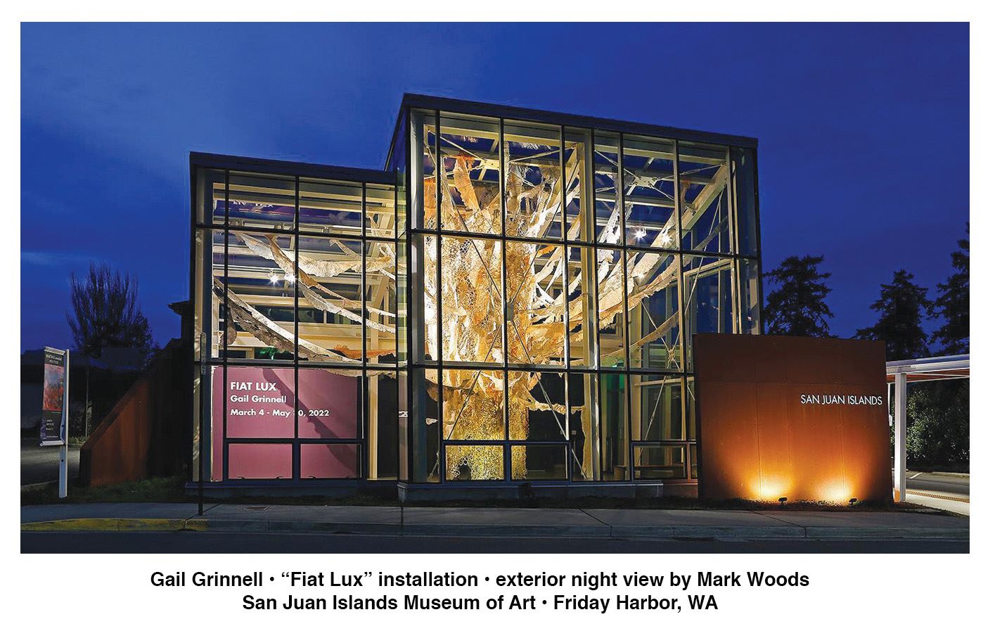
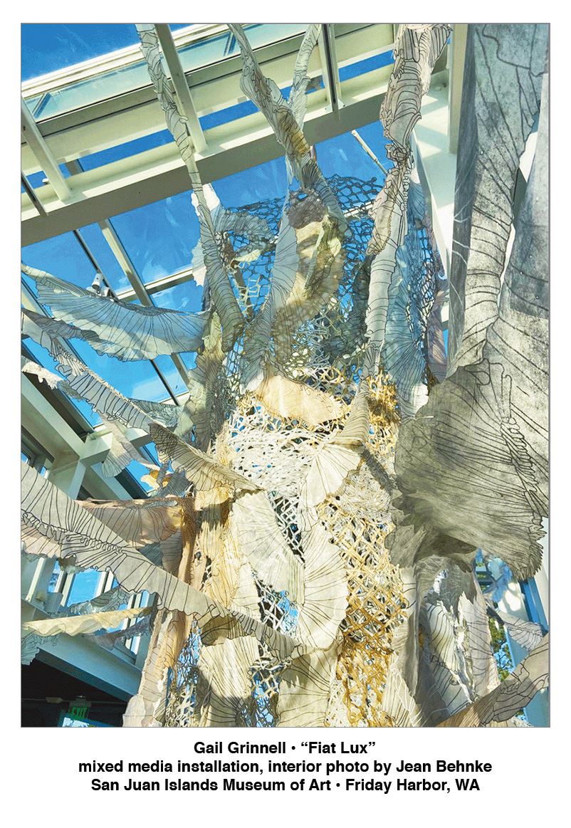 Gail Grinnell’s installation, “Fiat Lux,” takes up the tall-ceilinged atrium of the museum. It’s enormous, a tree-like structure of translucent drawn and cut interfacing that branches out to fill the entire space. The monumentality of the installation belies the fragility of material and construction: a dressmaker’s fabric, the delicate interfacing pinned into place; a traditional woman’s material; a traditional woman’s technique. Grinnell’s work with this material has evolved over the past three decades from flat, wall-hung forms to monumental, site-specific, free-hanging installations. Her images, inked and cut on tea-stained fabric—lace-like, curtain-like—began as dress patterns and ruffles, then evolved to vines and flowers—and to bones, bones. Her work references memory and family: her mother fitting dress patterns to her body, then fitting children—and parents—to that same body. (Life, itself, is interfaced and interwoven, patterns overlapped and repeated, seen through one another, linked and broken.)
Here, ruffles and chain-links predominate, images that reference domesticity and homelessness. In the museum’s atrium, the tree-like form also echoes a heart—the heart of the space, of the community. Shrouded translucent layers of chain-link fence form an outer chamber from which ruffles branch like arteries into the periphery of the space. As a tree, it offers shelter, but if a tree, this one has been lightning struck. The pale trunk opens to reveal a burnt core: a blackened column like a burnt wick at the center of a lantern…and this is the metaphor Grinnell settles on in her artist’s statement. Fiat Lux: Let there be light. A tree, a shelter, a heart, a lantern. Let there be light in this heart of ours, in this tree of life.
 Grinnell’s work opens onto Helen O’Toole’s masterful exhibit, “What Was: unmarked,” in the adjoining room. O’Toole’s paintings are also monumental, vast canvases of color and shade that dominate the walls on which they are hung with color and atmosphere like Monet’s “Waterlilies,” but with Rembrandt’s emotional lighting (think “The Night Watch”) and the power of Anselm Kiefer’s overwhelming, broken landscapes. O’Toole talks about her work as an excavation of Irish history: the trauma, the buried secrets, the suppurating wounds and scars of historical oppression seeped into the land. Her work is non-figurative, but tells a story using every element of scale, brushstroke, composition, color, and shade of traditional painting with all overt references removed.

You can find them in her written commentary: the buried bodies; the vanished children; the hunger; the resistance; the oppression. Can you find them without the narrative? Perhaps not, but you can feel them.
Born in County Mayo, Ireland, O’Toole talks about its “soggy scraps of bog land, dark soil, and dank smells wrapped in mystery, intrigue, and changing light.”
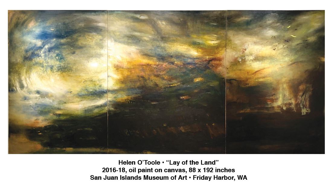
She could be talking about “Lay of the Land,” an 88 x 192 inches triptych that storms and swirls across the long wall of the gallery, golden northern light scumbled across what could be a darkening sky; shaft of light cascading down on an edifice not given; unspecified epiphany gathering force around an unseen actor; unnamed event of shattering significance. Rembrandt’s golden child, his gathering militia, is missing, but the feel of mustering forces, growing momentum, homegrown resistance, remains.
Breeding power from the earth, this is no dead land. “Trace,” a towering painting perhaps 192 inches high, speaks of entombment: broken light swirls high above a deep shaft like light glimpsed from the bottom of a well. Red forms curl at the bottom like buried bodies, shadowy blue ascending like spirits. The tropes are biblical: an apotheosis, a rising from the dead. A buried past that will not rest in peace. The gathering skies. A reckoning.
O’Toole’s “Pirate Queen” breaks into vivid color, pink swaths flashing flamboyantly across a landscape. She writes that this references a mythic 16th century woman, bringing a sense of flesh to the ravished landscape, the land as “brutalized,” as raped.
Her colors are as lush as Monet, but the feel is of Kiefer’s war-broken landscapes minus the straw—think “Margarethe” and “Nuremberg”—executed with paint alone. O’Toole’s painting is powerful and poignant; forcible colonization made tragically relevant with news from Ukraine.
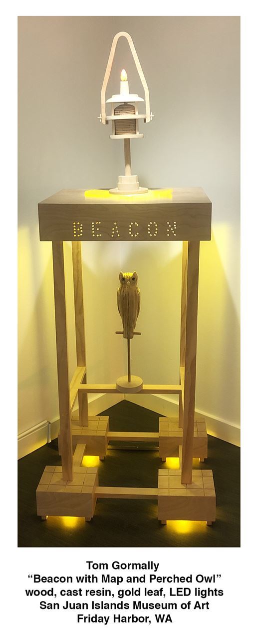
In his exhibition, “Into the Breach,” Tom Gormally also references cultural events, but if Grinnell and O’Toole do so with overlaid images and analogous forms or with the abstract tools of painting itself, Gormally uses concrete metaphoric imagery in his trenchant, whimsical sculpture. Totemic sculptures of fox and owl mix with political maps in red and blue, fox melding the Native American trickster figure of the coyote with a certain notable media giant.
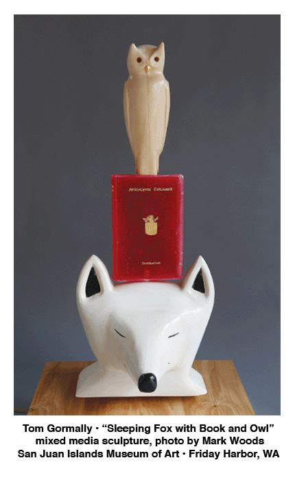 Religion inveigles its way in, a sleeping fox complacently balancing an explanation of the apocalypse in each hand in “Sun Setting on the Apocalypse with Sleeping Fox”; arrangements of owl and ax set in stasis on a wooden altar form, the forest remaining only as the drilled silhouette of a tree through which green light glow. “Ghost Owl” the wall reads; it’s titled “Clear Cut with Ax, Owl, and Tree”—a holy trinity. In Gormally’s immaculate sculptures of wood, cast resin, porcelain, and gold leaf, our patchwork quilt of red and blues states is under strain, wrenched together or apart, stabbed through the heart, hung on logging tongs like the remains of a toppled forest. But it’s not just the forest that’s endangered—it’s truth itself. It’s a grim message delivered with a side of fries, and goes down easy.
The work is up through May 30. You owe it to yourself to go.
Elizabeth Bryant
Elizabeth Bryant is an ESL/English tutor.
San Juan Islands Museum of Art, located at 540 Spring Street in Friday Harbor, Washington is open Friday through Monday from 11 A.M. to 5 P.M. For more information visit www.sjima.org.